Who we are and who we want to be
July 13, 2022
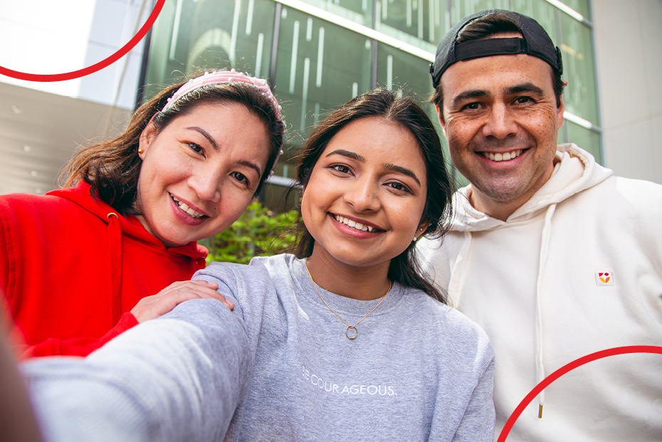
At NorQuest, our strength and our difference come from who is included. People – learners, instructors, staff, community partners – increasingly choose us because they love that we’re building a different kind of college here. Our ability to adapt and to seek better solutions is at the core of who we are at NorQuest. We are powered by the kindness and compassion that we aim to be known for, and our commitment to anti-racism and equity, diversity, and inclusion.
With these key goals in mind, NorQuest recently embarked on a new take of our existing NorQuest brand. The college took a deep dive into the visual identity, personality, and deeper purpose of how NorQuest is represented, guided by accessibility to support inclusion.
“First of all, we had to educate ourselves,” says MJ Fell, Manager, Communications and Creative Services. “What does it mean to have an inclusive brand—and how do we support and create that? We turned to our colleagues across the college with expertise in accessibility and inclusion and started the discussion. Those conversations made us realize we had a lot to think about and do. It also made us realize that creating an inclusive brand will take time to evolve.”
Brand can be an elusive concept. More than just a logo and official colours, brand represents something very important: who we are, who we include, and how people feel when they think about and interact with NorQuest College. NorQuest’s refreshed brand is about so much more than mere visual tweaks. It’s guided by accessibility and inclusivity to better position NorQuest to where the college is today and where it is going, aligned to our NorQuest 2030 strategy. Together, the visual and verbal elements of our brand represent what we do and what we stand for.
Helen Ma and Hilary McHale are NorQuest’s talented graphic designers. They share that the refresh was a fascinating process where graphic design, research, and accessibility intersected.
“At first, it was like decluttering a house,” says McHale. “We had to get rid of a lot of the elements we had been using for years and look at everything with fresh eyes and a new focus. Things that were abstract had to be made tangible. For instance, we were unable to find an official accessibility standard for typefaces, so we created our own criteria based on research to support high legibility and accessibility.”
“We wanted to develop visuals that truly represent our college community and its values,” says Ma. “When we use ‘see yourself here’ and ‘we are who we include’ as marketing phrases, that has to be real. We want everyone to really feel those concepts.”
Guided by the twin concepts of accessibility and inclusion, the Communications and Creative Services team went through weeks of brainstorming, research, and discussions. This research led to a bold visual identity with a bright colour palette, a highly legible and unique font, and photography concepts that represent our diverse and vibrant college community.
“Refreshing our visual identity with accessibility in mind helps us take a step forward to create text and digital material that can be perceived and understood by people with disabilities.” says William Hamilton, Manager, Accessibility Services. “It’s a valuable expression of NorQuest’s commitment to inclusion and accessibility.”
For everyone who has a connection to NorQuest, our brand is defined by each person’s experience with the college. The initial brand refresh – and its continued evolution as we reflect and learn more about inclusion – is a big step in showing the college as we are now and who we want to be in the future.
Learn more about NorQuest’s refreshed brand and explore the NorQuest brand book.
Related stories
See all stories
Improving communication skills in your organization
Learn how improving communication skills in your organization can boost collaboration, enhance productivity, and reduce turnover.
June 17, 2024

Reflecting on excellence and honoring success at the 2024 Convocation
On May 30 & 31, the NorQuest community gathered in joy to celebrate Convocation. Congratulations to the class of 2024!
June 5, 2024
All smiles at the first Insurance Professional completion ceremony
Celebrating the graduates of the the inaugural cohort of the Insurance Professional program at the summer ceremony